UpSpot, Photofeeler & AngelList

I don't remember how I heard about UpSpot. I think, I got an email invite to try it either through LinkedIn or AngelList. But having received the email, I decided to check it out. The website seems to focus on highly skilled technology professionals, allowing a social media platform for technology consultants/freelancers. So UpShot certainly fulfils a niche as Freelancer is too general and full of odd development jobs. So I was intrigued with UpSpot and decided to make a profile.

I started it but stopped, and forgot about it. But the founders of the site are very proactive as the site grows, so one called me up and encouraged me to complete my profile. I started doing that but quickly realised how out of date everything was. Including my profile picture. Indeed, I didn't have a good recent head shot! Trying to decide on profile pictures lead to discovering PhotoFeeler, which is a website that rates profiles photos in the category of business, social and dating. You can pay for votes or vote yourself to earn karma. I got about five photos rated just using karma. None of my pictures scored very highly. The picture with this post was the best of the lot. I think it is good enough for now. I'll have to take some better head shots later. As for UpSpot, I haven't gotten any jobs through there yet. But I am cautiously optimistic.
Tea Tracker: A UX Story

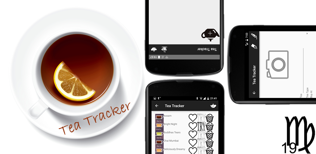
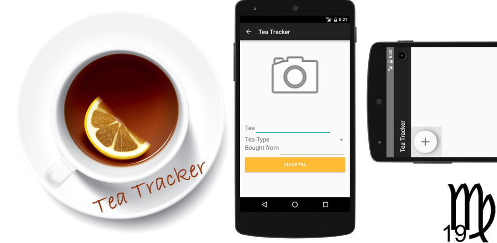
I have made a significant change to Tea Tracker. It was so obvious that I am wondering why I didn't think of the feature from the start! The obvious answer to why it took me so long to put in this important UI change is that when I first thought of the Tea Tracker app, I envisioned it as a grid of tins. So, when I built it, a grid of tins is what I put in the "main activity". 

However, just using the app for awhile showed me that I had missed something vital for a good user experience. Yes, the app showed my tins, but it did not quickly show me which tins were full and which what tea! That was a real "D'oh!" moment and made me glad that I have not yet run a huge promotion campaign for the app.

The marketing push is coming, but I want to spend a few more weeks refining the app. Also, I would like to add a widget feature and not to mention, test it more by using it myself. I mean, I did make this app because there was a need for it in my life.

It is, however, interesting how easily it is to miss UX pitfalls. Of course, part of the reason missed such an obvious UI usability issues is because I am used to doing, as I like to say, "everything but the pretty graphics". I didn't do what I know my friends in UX design would have done, which is that they would sit down with pen and paper and start with the user interaction. They would develop apps top-down. As a middleware and backend engineer, my first instinct is to build from the bottom up. But this, as was the case with my Tea Tracker app, can lead to UX blindspots.

I will need to change Virgo 19's development workflow to avoid this in the future. Especially since the next app in the pipeline is made for toddlers! Now that's a tough demographics!